Thursday, 8 December 2011
Monday, 5 December 2011
Wednesday, 19 October 2011
PSA Propaganda Research
Bandwagon:everyone is doing it

Testimonial: person endorses a product

Transfer: using words to transfer an emotional response (association)

Repetition:

Emotional:

Card Stacking: comparing two similar products with one always superior

Plain Folks: an average Joe

Name Calling: using words to give a negative connotation

Logical Fallacies:

Glittering Generalities:

Rewards:
Imagery:
Monday, 17 October 2011
Sunday, 2 October 2011
AIGA Radical Craft
The concept for this design orbits around the idea of drafting, and the skeletal elements of type. The title "Radical Craft" is set in a group of lines to imitate a type anatomy chart; Additionally I chose Adobe Garamond Pro for my design, because using the revival of an old style serif typeface would convey a sense of timeless design and structure. The choice to put light strokes around the type was in effort to create the look of pencil outlines. However, this is something I might have to redesign because I've already received comments about readability issues. The texture and clipping mask on the title font are my watercolor paintings that were scanned into a computer. I did this because, although design is primarily a digital process, these ideas or concepts should be developed just as any other art form through drafting, sketching etc. As a whole, I wanted this poster to communicate the process of design-our craft.
Sunday, 18 September 2011
Chantry Poster #2
The image quality for this poster is pretty terrible because the png file size was "too big" to upload. I had to reduce size and quality to be able to put the image on blogger.
Sunday, 11 September 2011
Monday, 29 August 2011
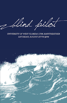
post-crtique changes
During critique Joseph pointed out to me that I had excluded "the fine" from spelling out the CFPA acronym. (Dumb spelling error.) I decided to spell out University of West Florida instead. From both discussions in and out of class I was told that the body font was clashing with the title font. Someone also suggested that all type should be the off white color.
Wednesday, 24 August 2011
Subscribe to:
Comments (Atom)


